UI/UX Design Case Study:
On-Demand Drone Survey Solutions
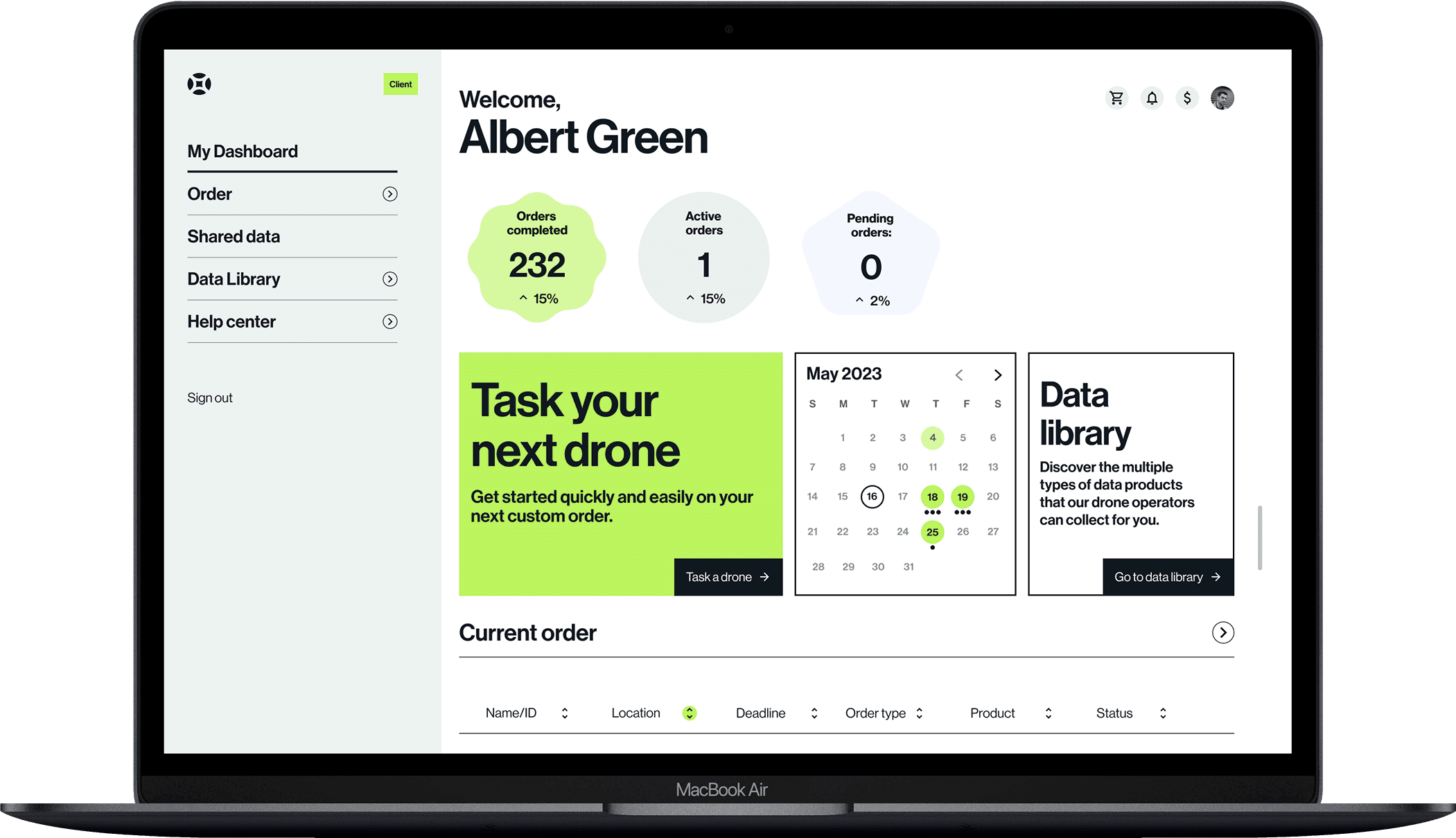
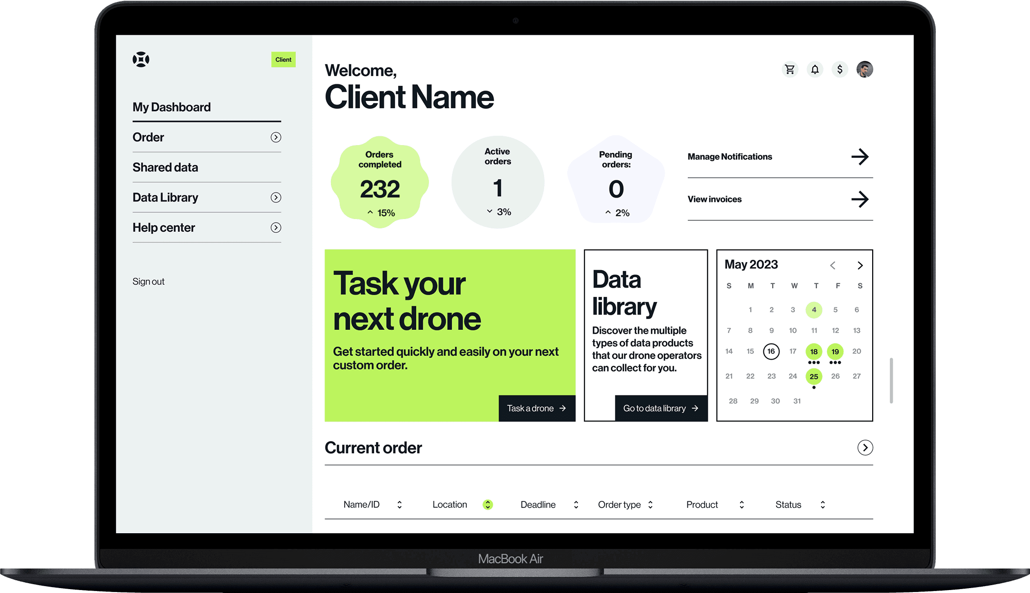
At Globhe, I crafted user-friendly dashboards that made it easy for people to make decisions. By putting users at the center of our design approach, I revamped the flow of the platform, making it smoother and more intuitive. These changes didn't just make things easier to use; they also helped users navigate with confidence, empowering them to make better choices effortlessly.
Project Overview
Company Background:
Globhe operates as a drone data provider, leveraging a global network of drone operators to collect high-quality, on-demand aerial data. This data is used by businesses and organizations across multiple sectors, including agriculture, environmental monitoring, disaster management, and infrastructure inspection.
Project Scope:
Simplify the User Flow: The existing user flow was complex and unintuitive, causing frustration for users. Our objective was to streamline the process, making it more efficient and user-friendly. This involved analyzing the current flow, identifying pain points, and redesigning the journey to ensure a seamless experience.
Fix UX Issues: Various usability issues were identified that hindered the overall user experience. Our aim was to address these issues by iterating on design solutions based on feedback. The goal was to enhance user satisfaction and engagement by resolving these critical UX problems.
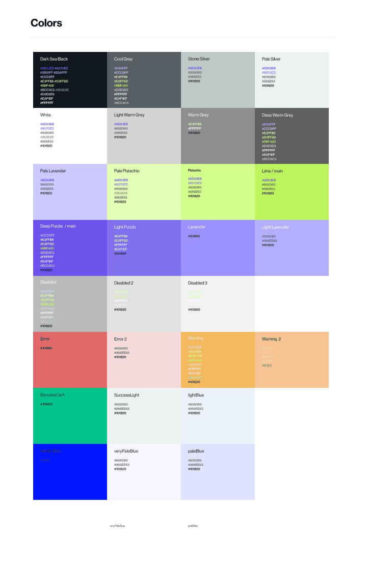
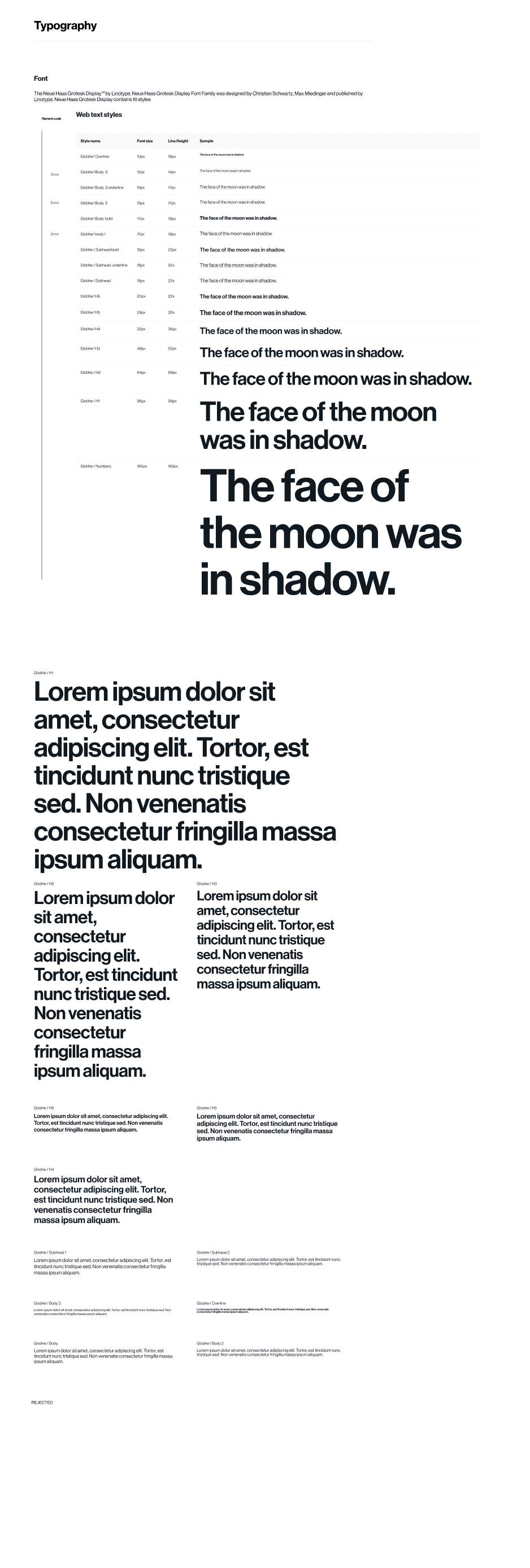
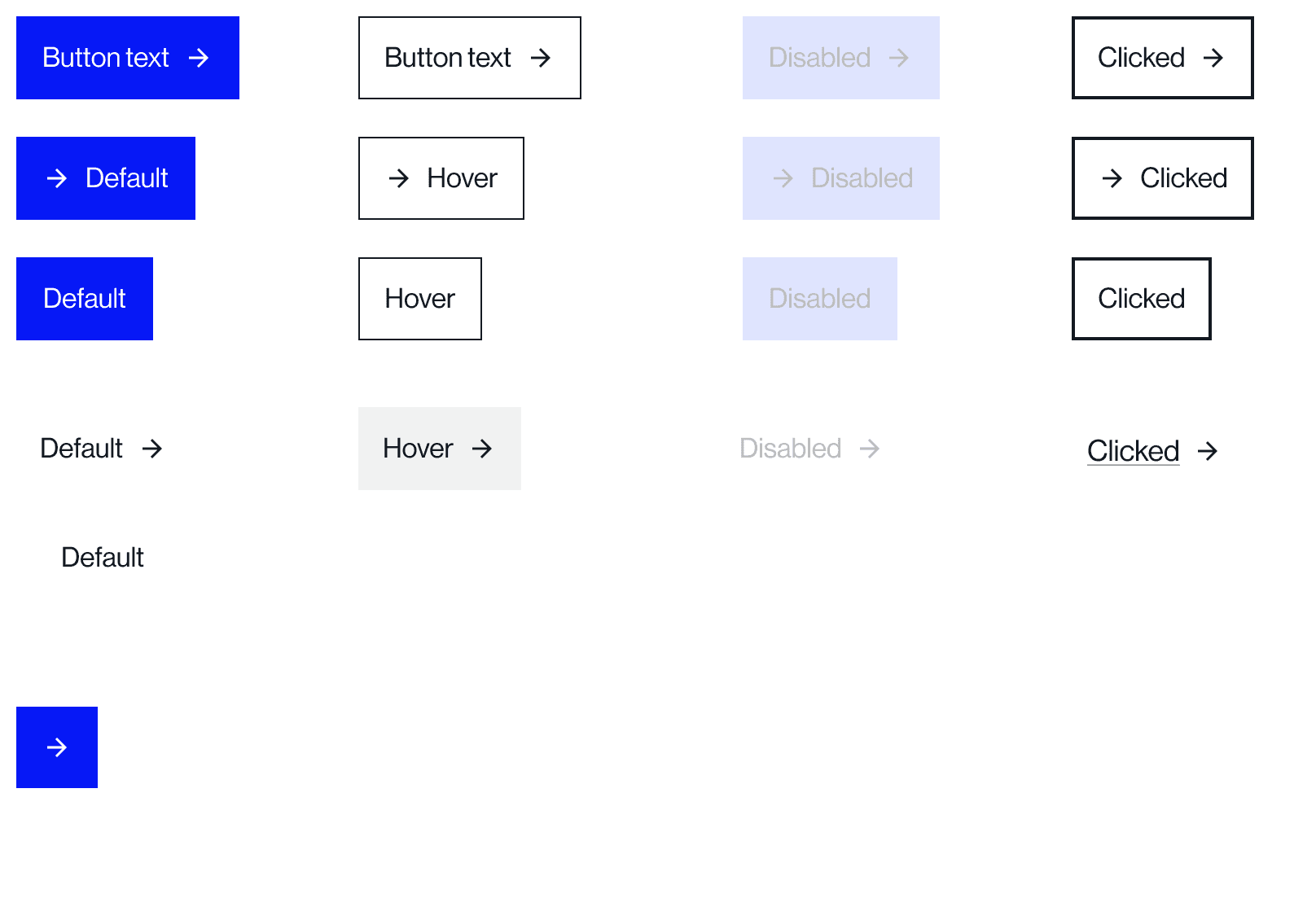
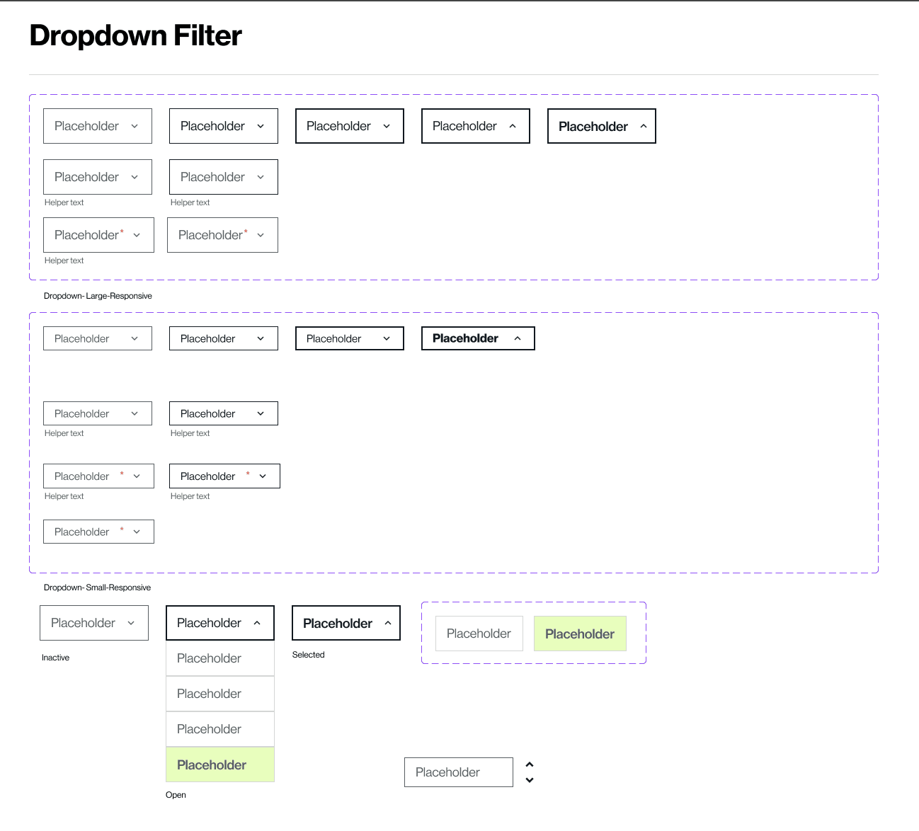
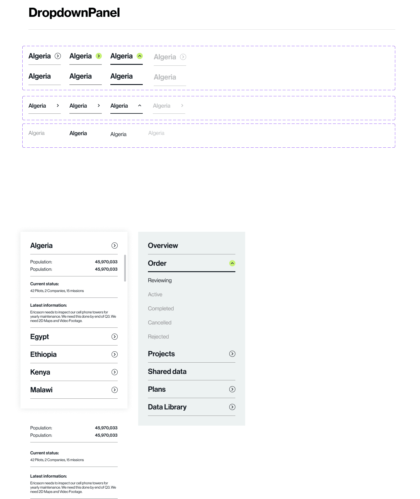
Integrate a New Design System: The project also aimed to establish a cohesive and modern design system that could be consistently applied across all interfaces. This involved creating a comprehensive set of UI components, design guidelines, and style guides to ensure a unified and aesthetically pleasing look and feel. The new design system was intended to improve visual consistency, maintainability, and scalability of the product.
Role:
At GLOBHE, a leader in on-demand drone survey solutions, I was responsible for enhancing the user experience and interface design. My role encompassed the following key areas:
Analyzed the existing user flow to pinpoint and address critical UX issues.
Developed wireframes and high-fidelity prototypes to illustrate and refine user interactions.
Led the creation of a cohesive design system, including a comprehensive set of UI components and style guides.
Ensured the visual design was modern, consistent, and aligned with GLOBHE’s brand identity.
Collaborated closely with developers and stakeholders to ensure seamless implementation of design solutions.
UX Assessment
Complex User Flow:
The existing user flow was overly complicated, leading to user frustration and inefficiency in completing tasks.
Navigation was unintuitive, making it difficult for users to find and access essential features and information.
The onboarding process was not user-friendly, causing confusion and a steep learning curve for new users.
The platform’s mobile version was not optimized, resulting in a subpar experience for users accessing it on mobile devices.
The visual design did not consistently reflect GLOBHE’s brand identity, leading to a lack of brand coherence.
Wireframes and Prototypes
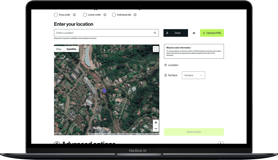
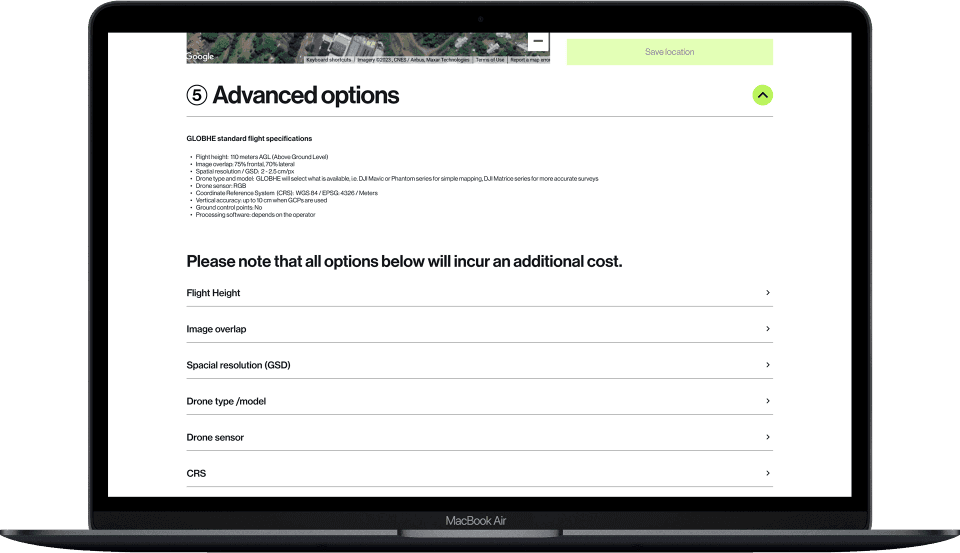
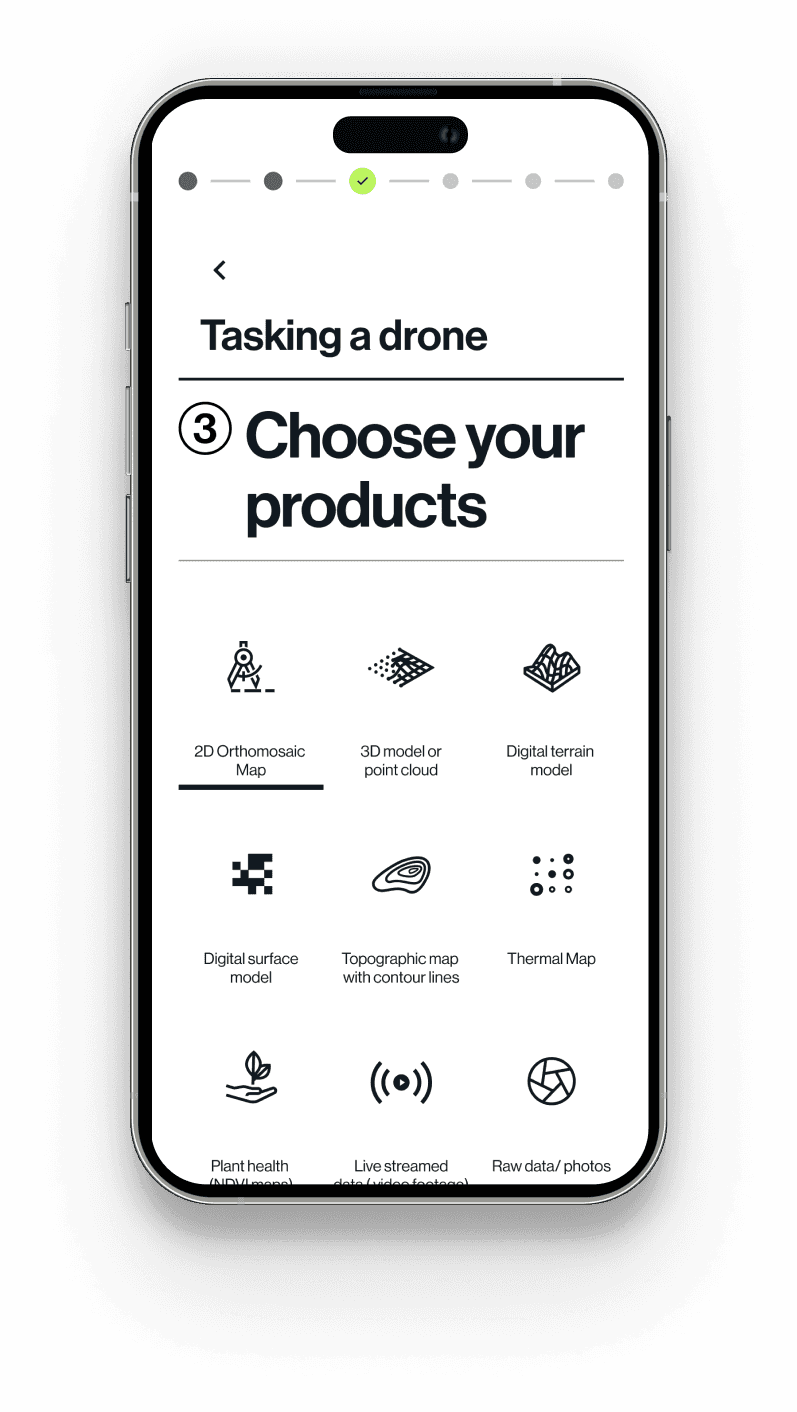
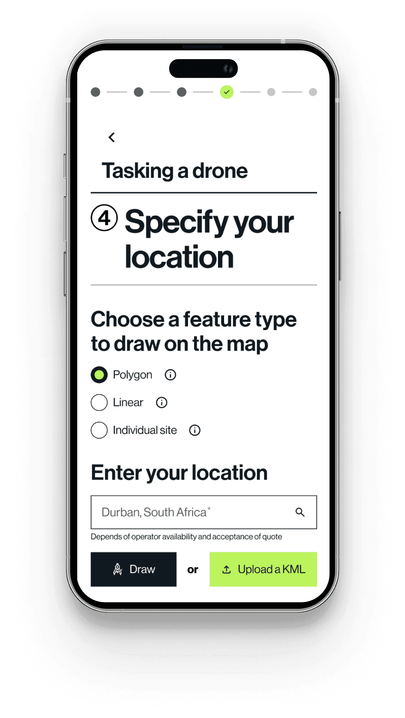
Simplifying the "Order a Drone" Flow
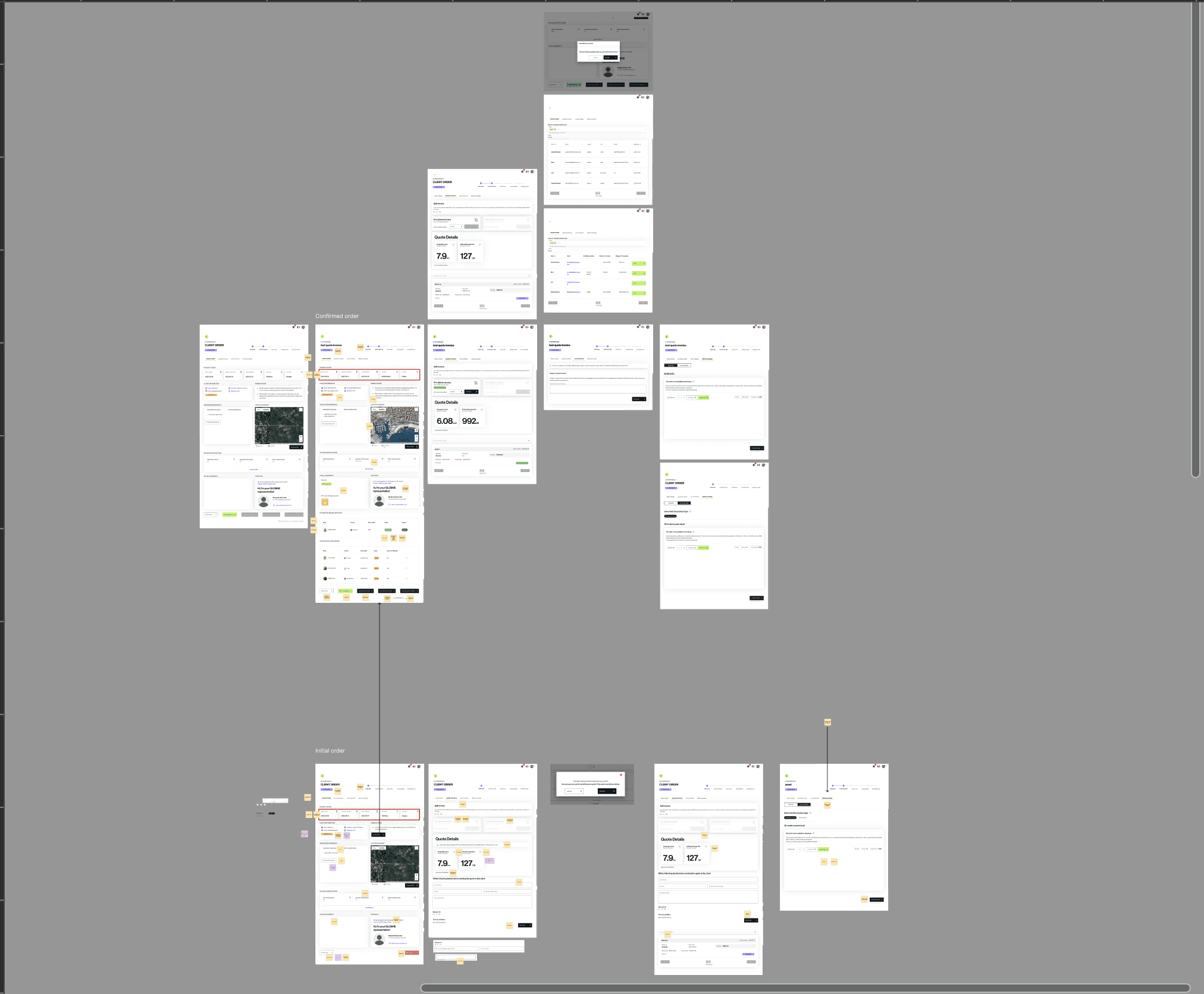
User Flow Analysis and Mapping
Conducted a thorough analysis of the existing user flow to identify bottlenecks and unnecessary steps.
Mapped out an optimized flow that minimized the number of steps and clarified the process.
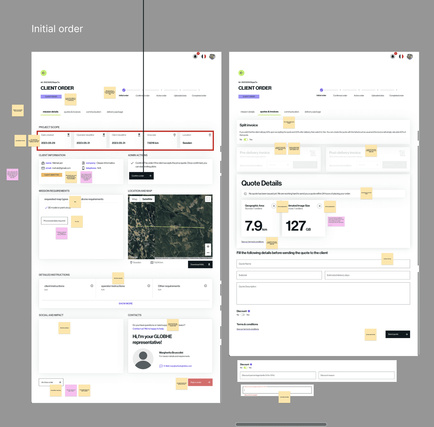
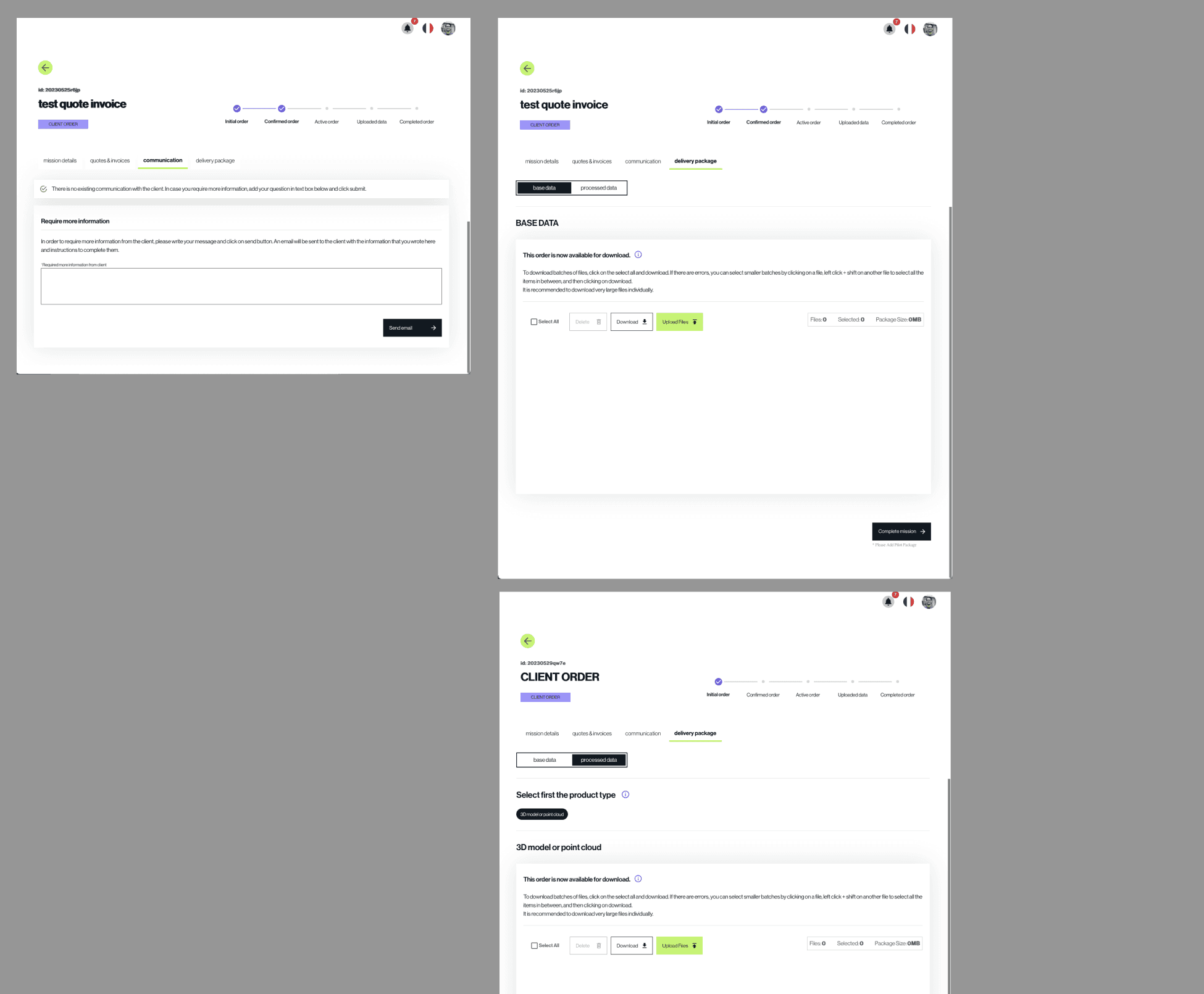
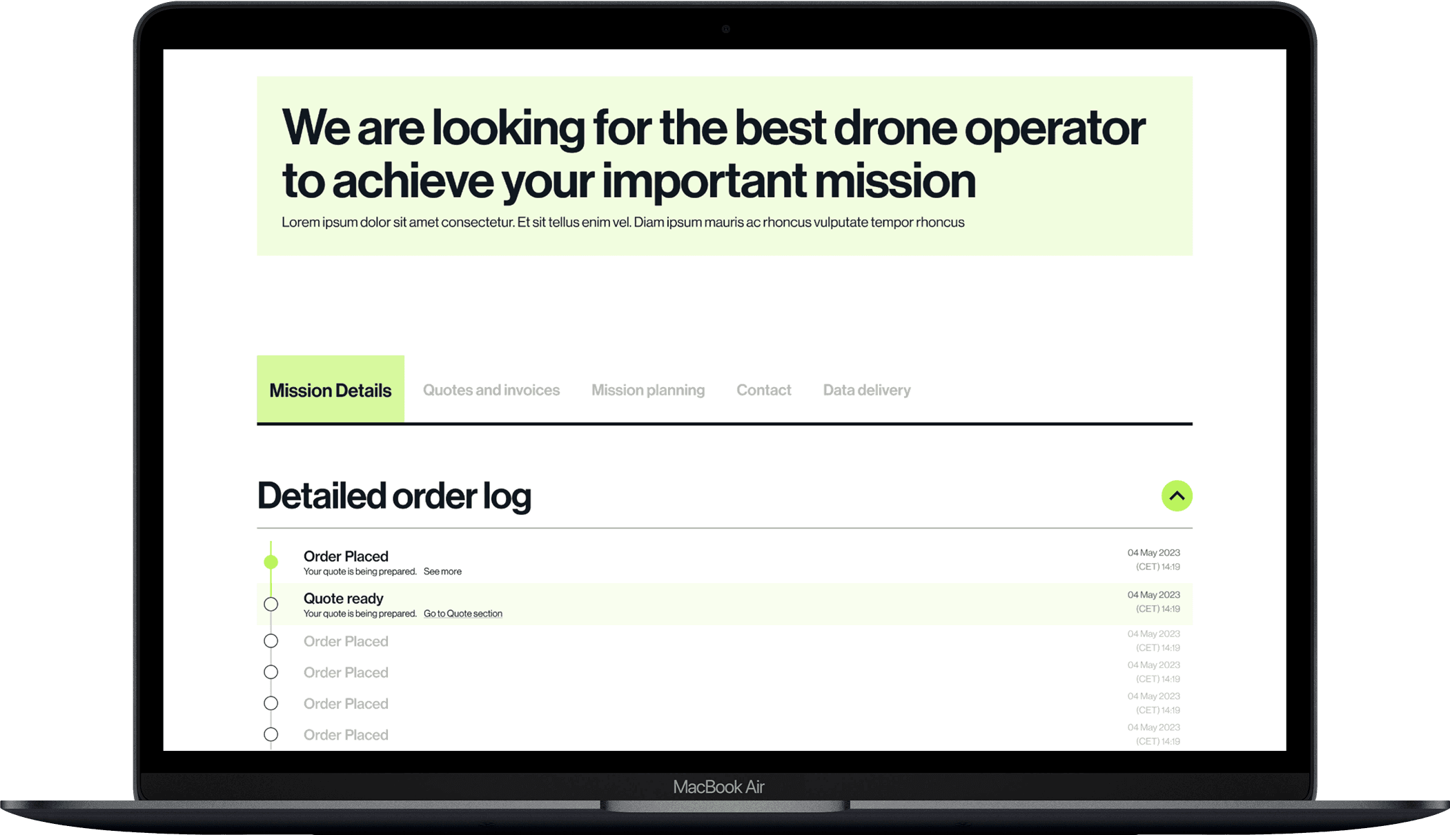
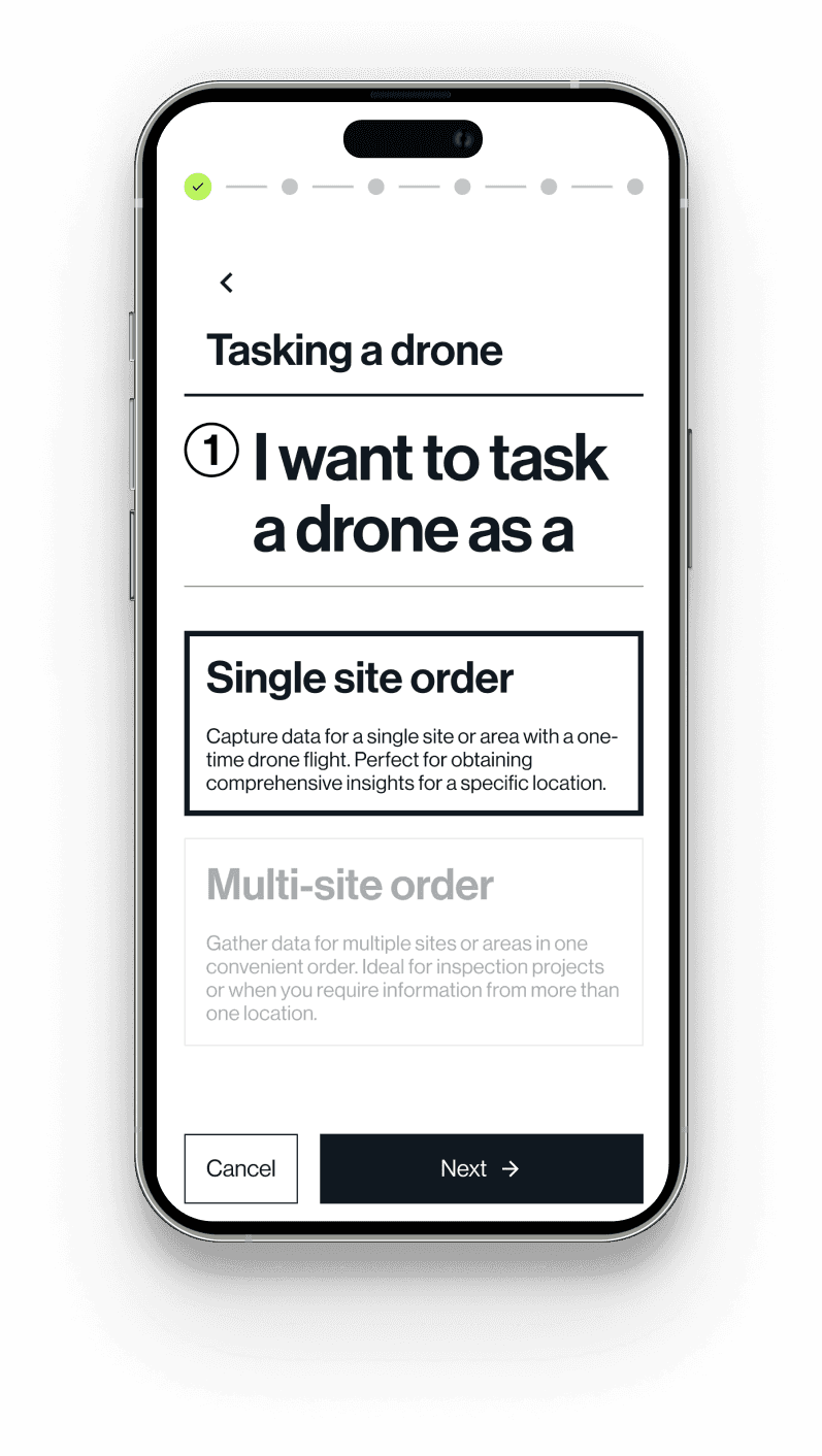
Clear Step-by-Step Guidance
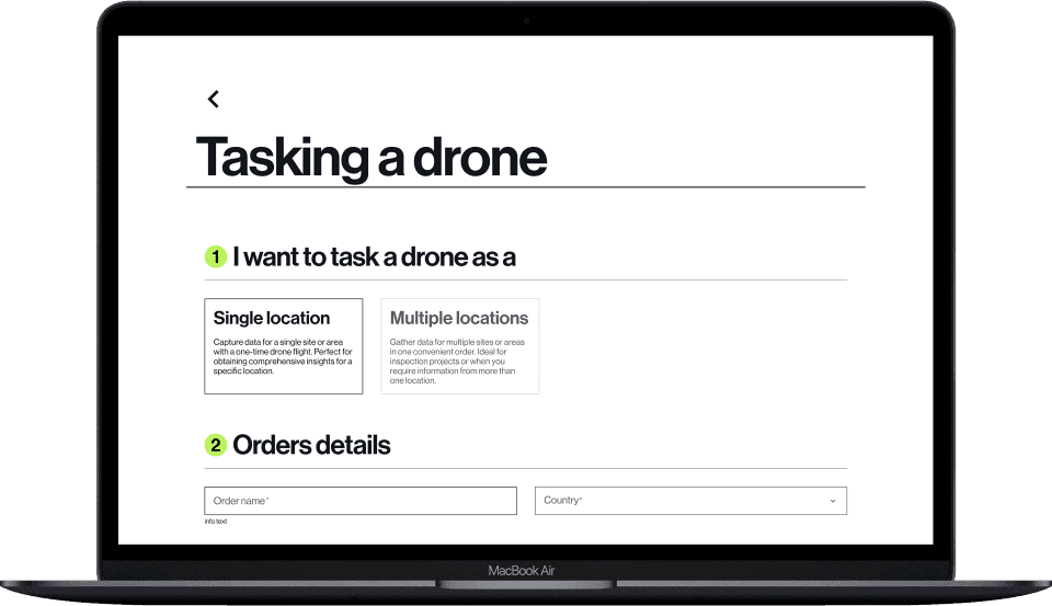
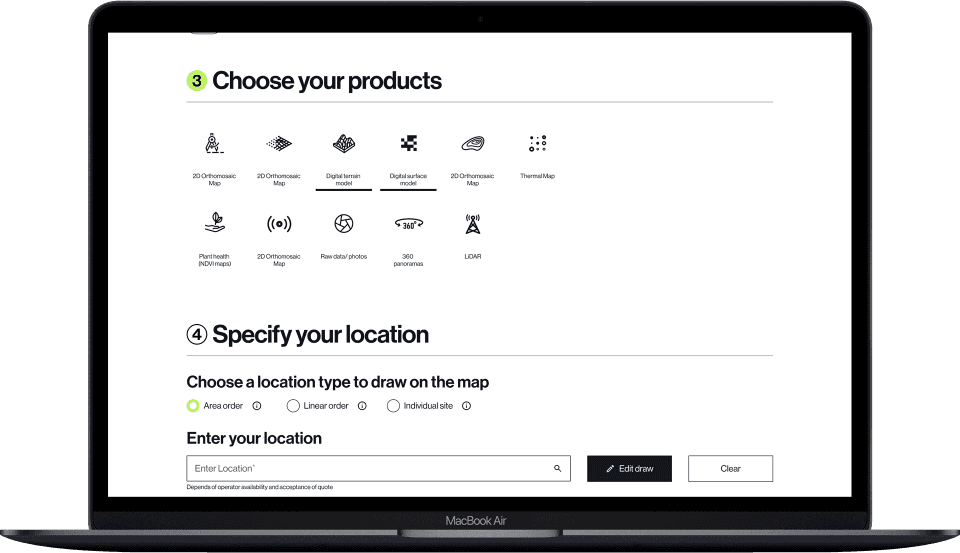
Broke down the ordering process into clear, manageable steps.
Introduced visual cues and progress indicators to help users understand where they were in the process and what steps remained.
Intuitive Interface Design
Redesigned the interface with a focus on simplicity and ease of use
Used consistent and familiar UI elements to reduce cognitive load and improve navigation.
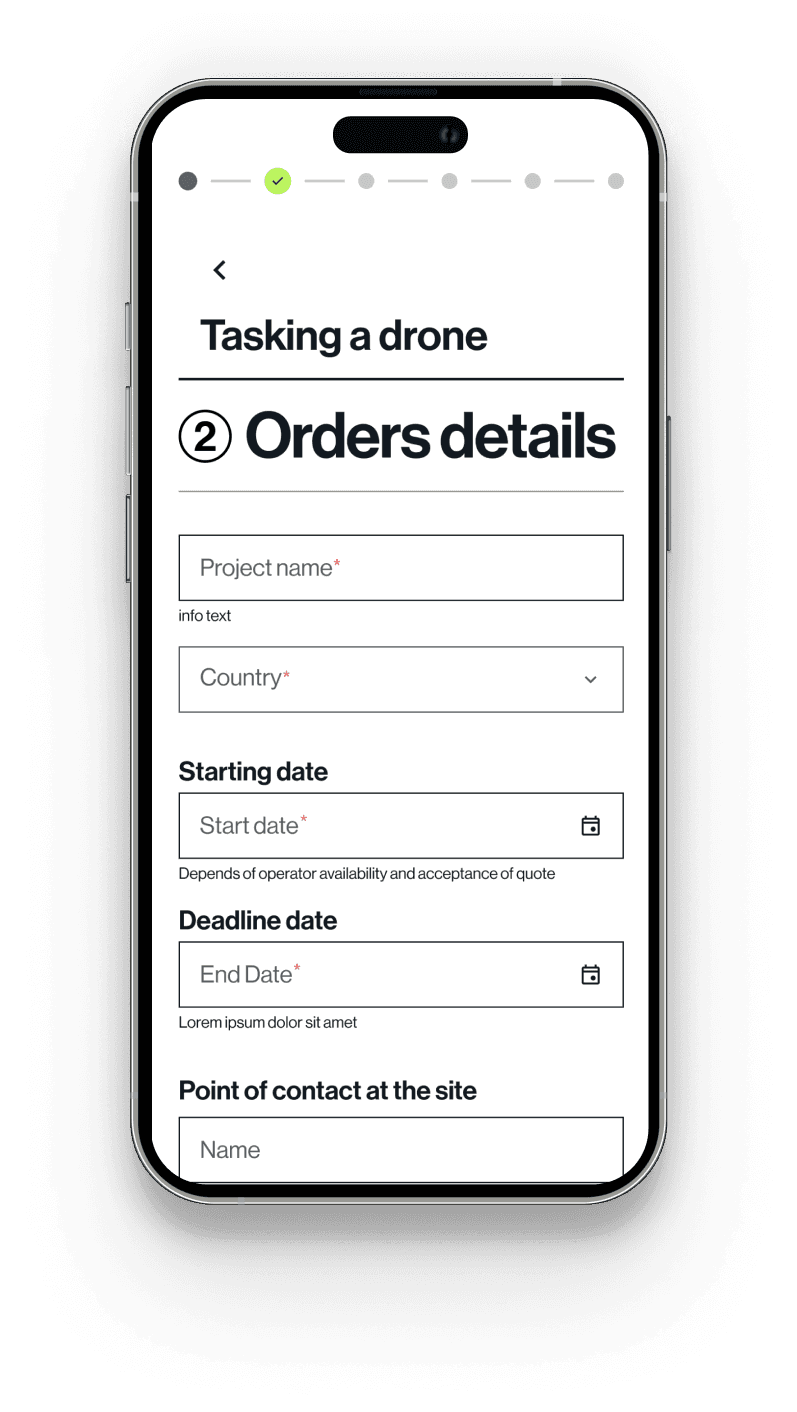
Streamlined Forms
Simplified forms by removing unnecessary fields and consolidating information requests.
Implemented smart defaults and autofill options to speed up data entry.
Contextual Help and Tooltips
Added contextual help and tooltips at critical points to guide users through the process without overwhelming them with information upfront.
Ensured that help was easily accessible but non-intrusive.
Mobile Optimization
Optimized the flow for mobile devices to ensure a seamless experience across all platforms.
Used responsive design principles to make the interface adaptable to different screen sizes.
Real-Time Feedback
Provided real-time feedback to users on the status of their input and progress, helping to prevent errors and reduce frustration.
Implemented validation checks to ensure data accuracy and completeness before submission.
Confirmation and Review
Added a review step where users could confirm their details and order before final submission.
Provided clear confirmation messages and next steps after the order was placed.